Meet the redesigned AgileMana
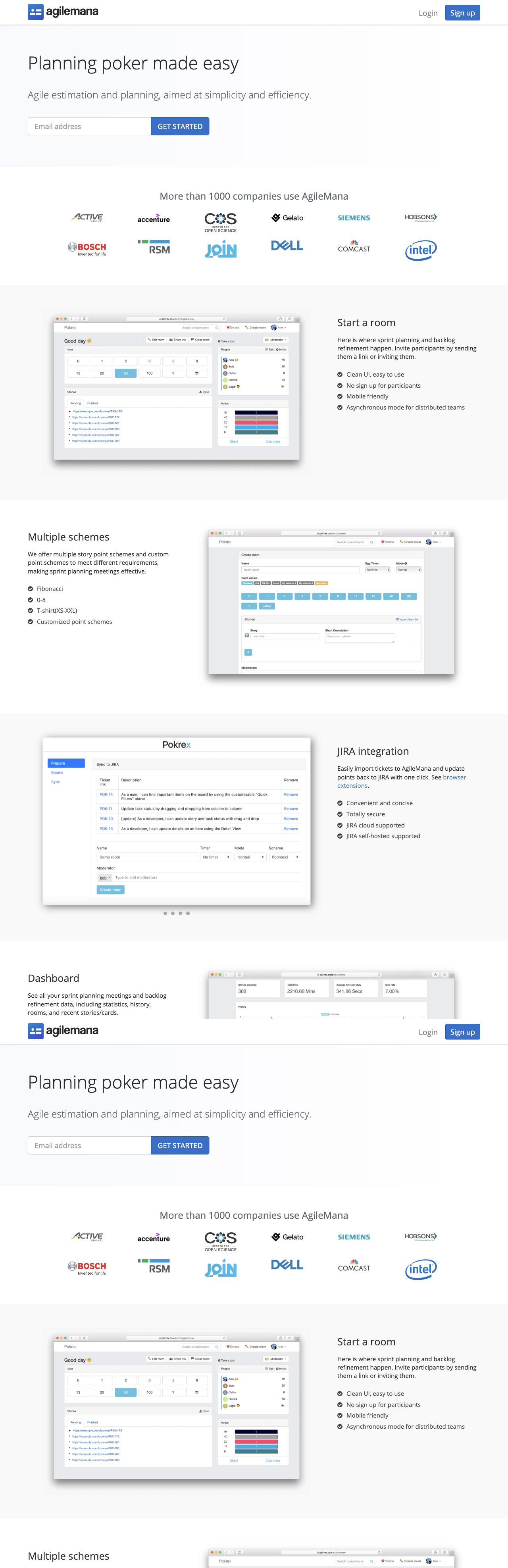
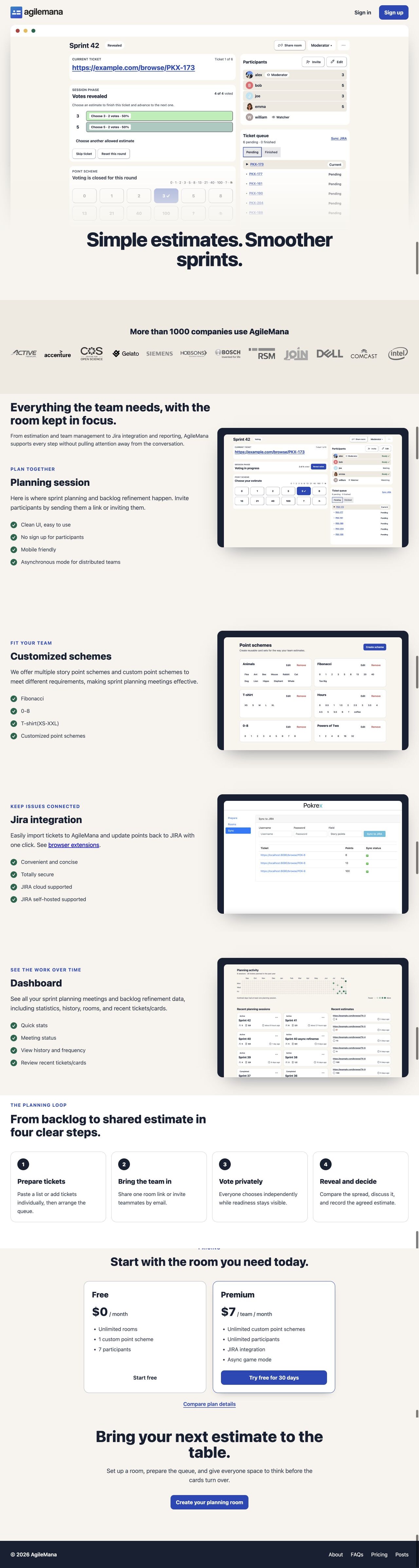
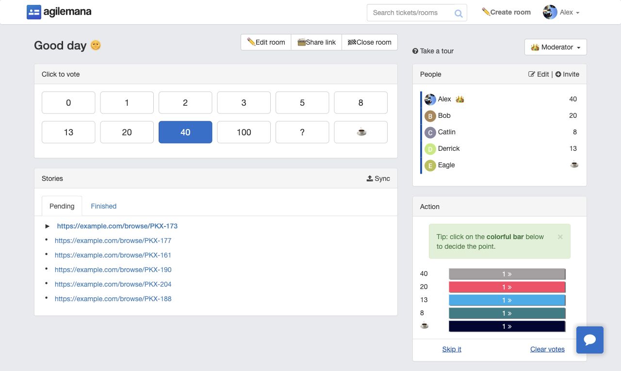
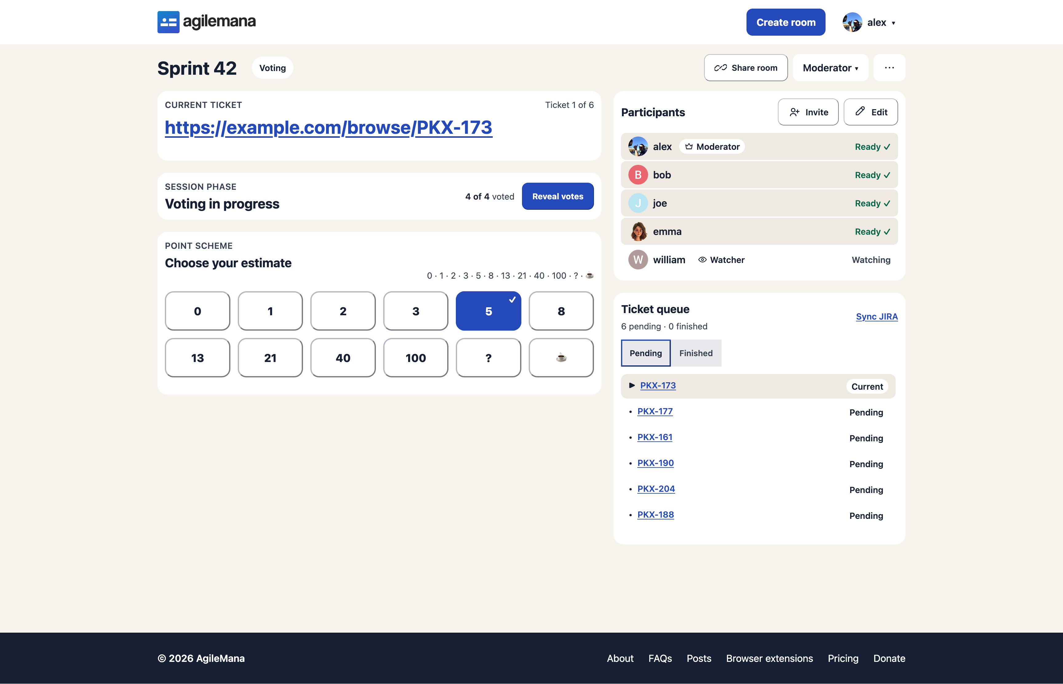
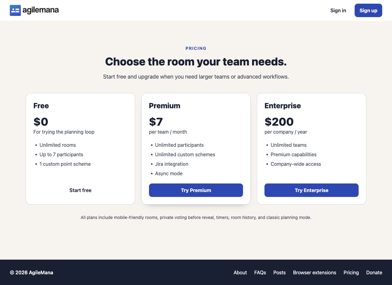
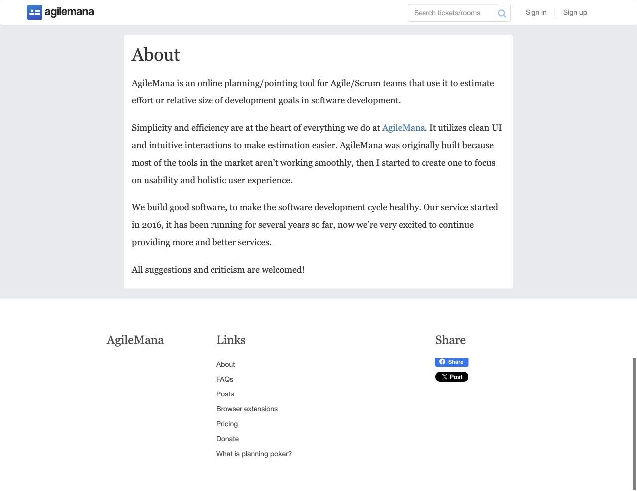
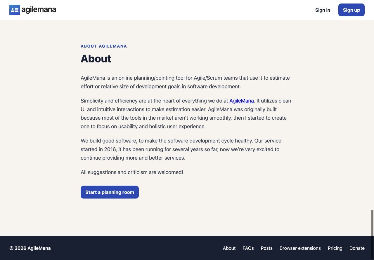
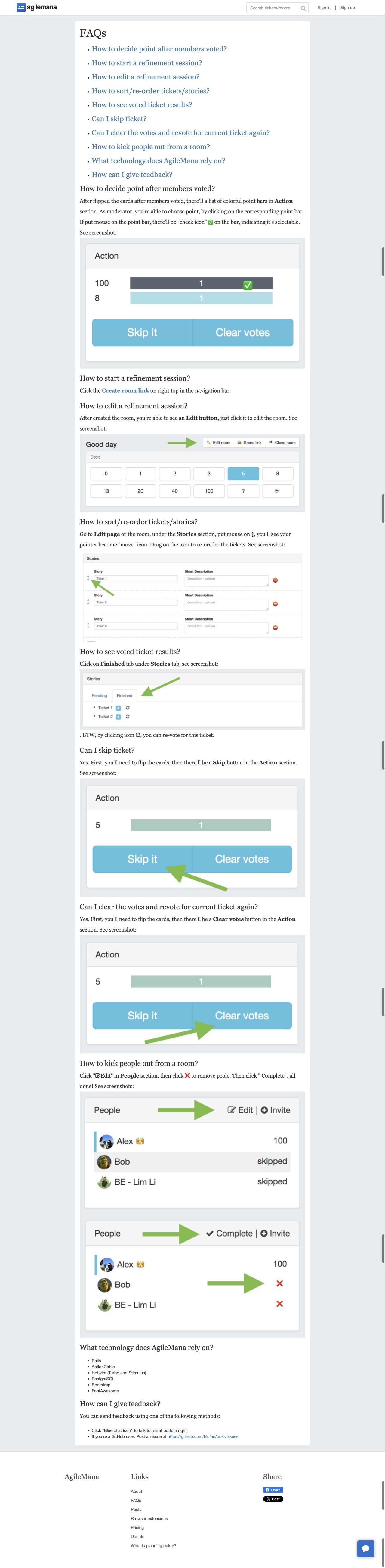
AgileMana has a new look from the homepage to the planning room. The redesign keeps the workflows you know, while making the current task and the next action easier to find. In every comparison below, the previous version is on the left and the redesign is on the right.
Homepage
The new homepage shows a striking hero image to show the new refinement session, it also tells the planning story in a clearer order: prepare tickets, invite the team, vote privately, and agree on an estimate.
Planning room
The current ticket is now the strongest element on the page. The room shows one clear phase, private voting choices, participant readiness, the ticket queue, and moderator actions in a predictable order.
Sign in and account access
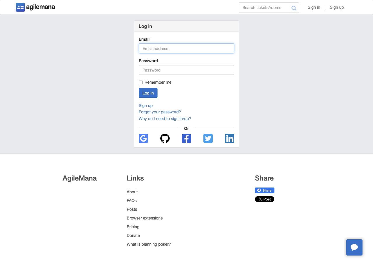
Authentication is now a focused, single-purpose experience with clearer labels, stronger hierarchy, and less surrounding distraction.

Sign up
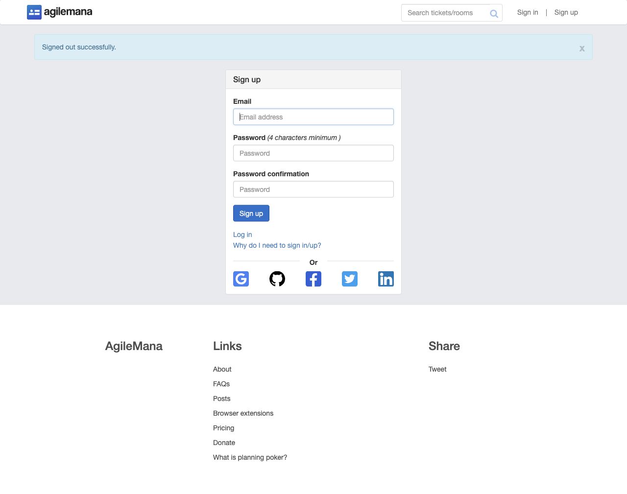
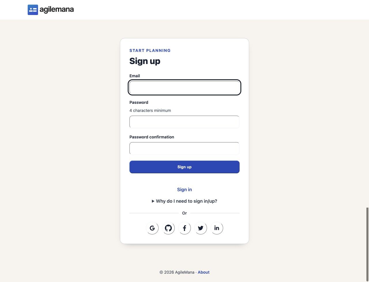
Creating an account now uses the same focused authentication layout, with clearer password guidance and a simpler path back to sign in.
Pricing
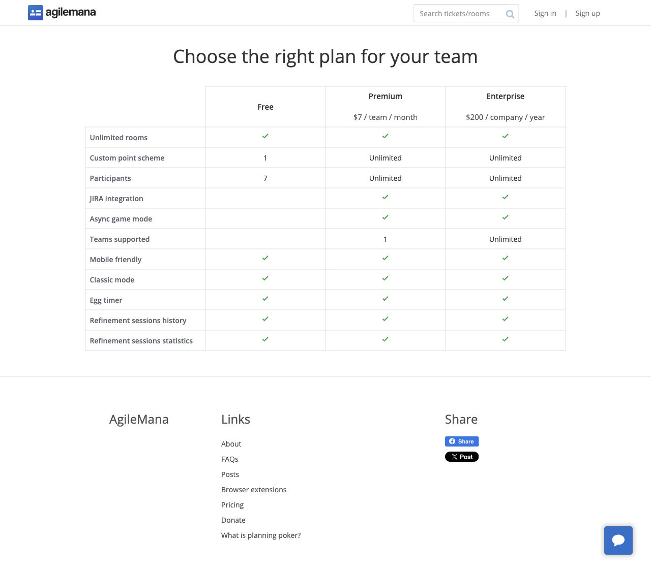
Plan choices are now readable cards instead of a wide comparison table, with benefits and next steps grouped by plan.
About
Add a sign up button.
FAQ
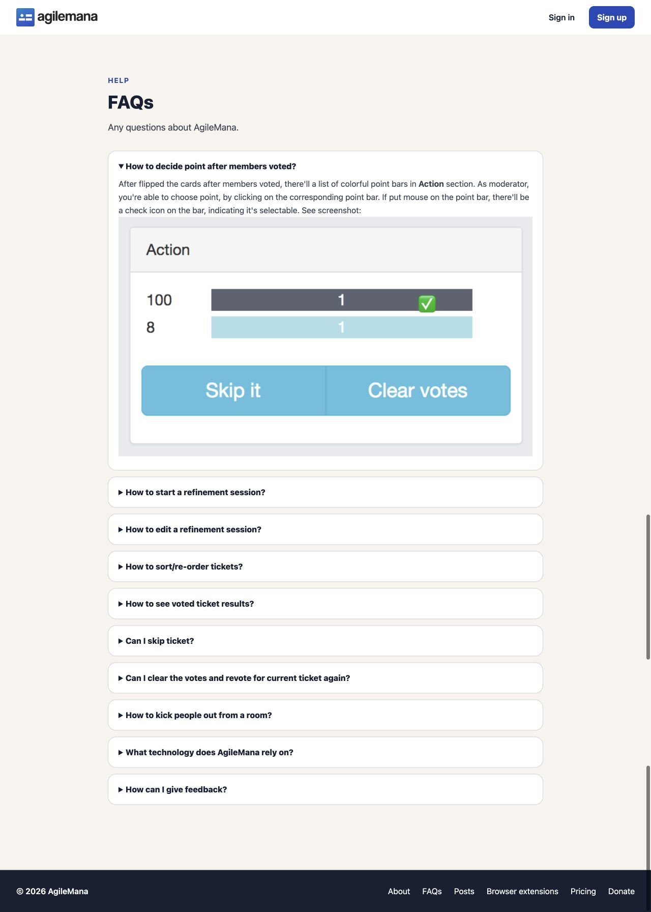
Questions are grouped into sections with more whitespace.
Posts
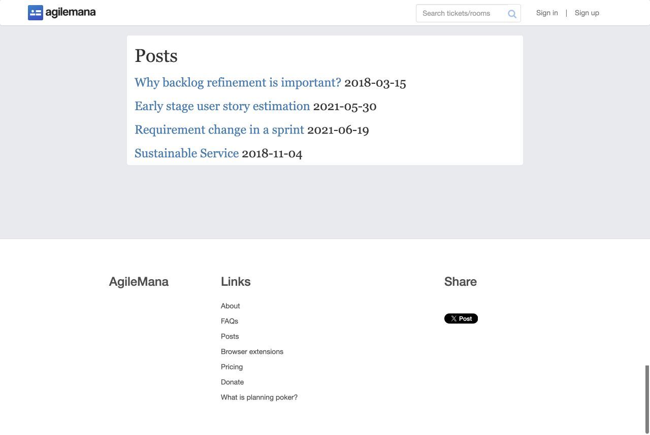
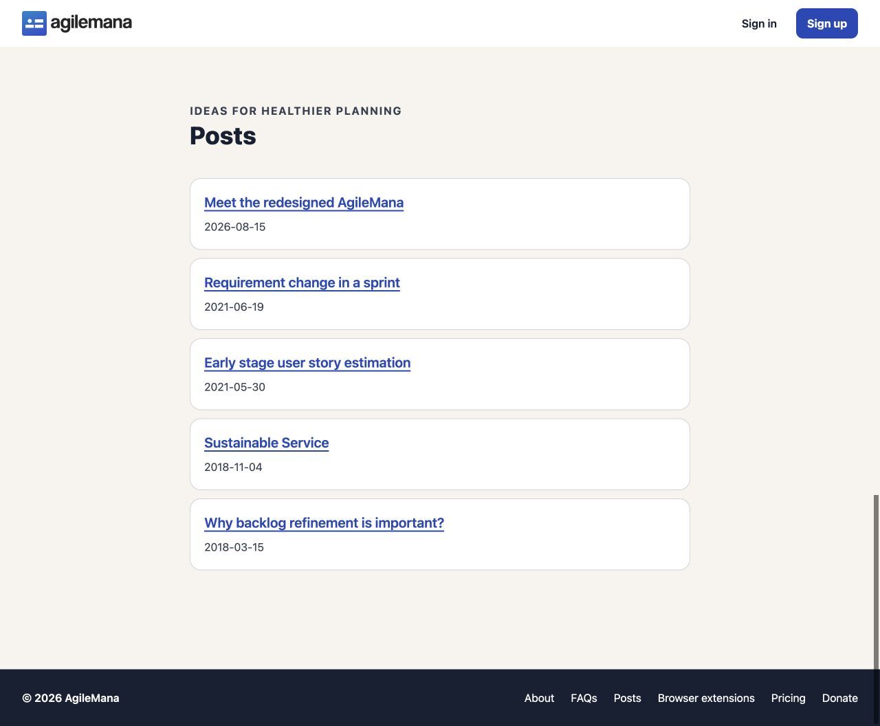
The article index now uses consistent typography and spacing, with a back to post listing page link.
Browser extensions
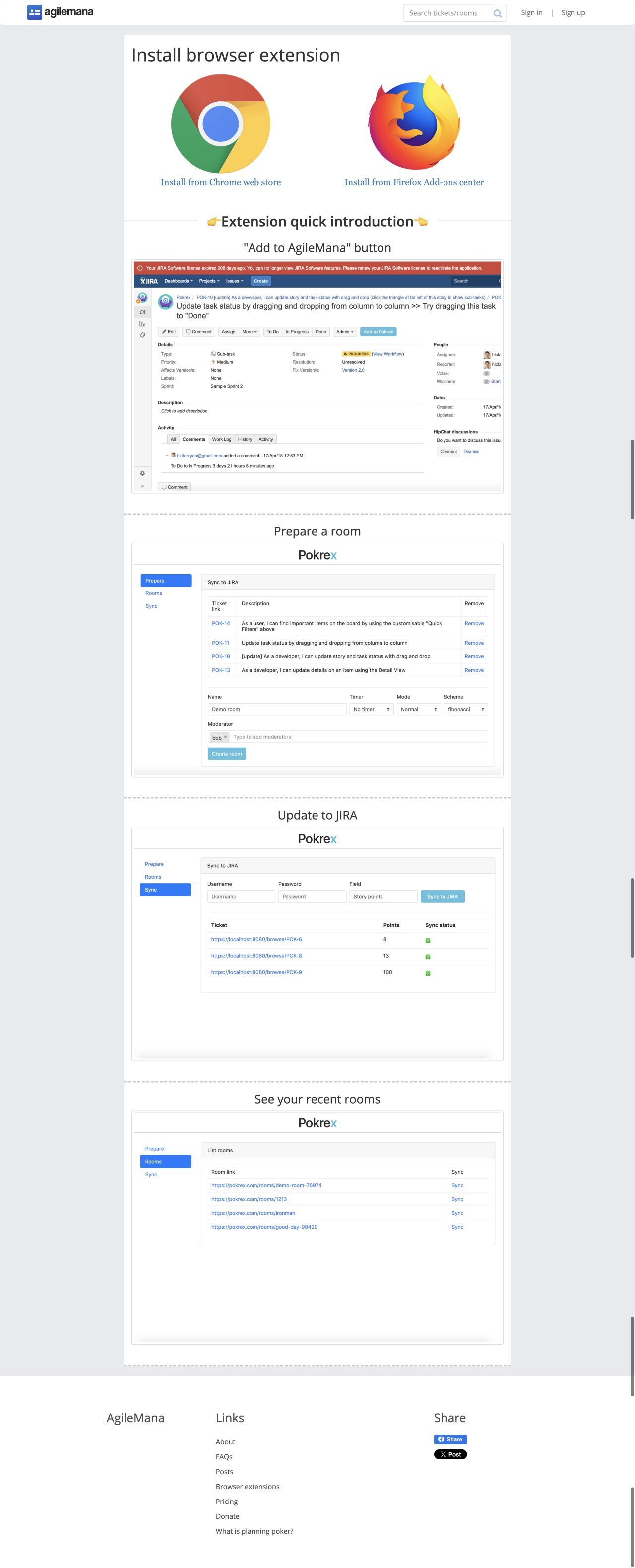
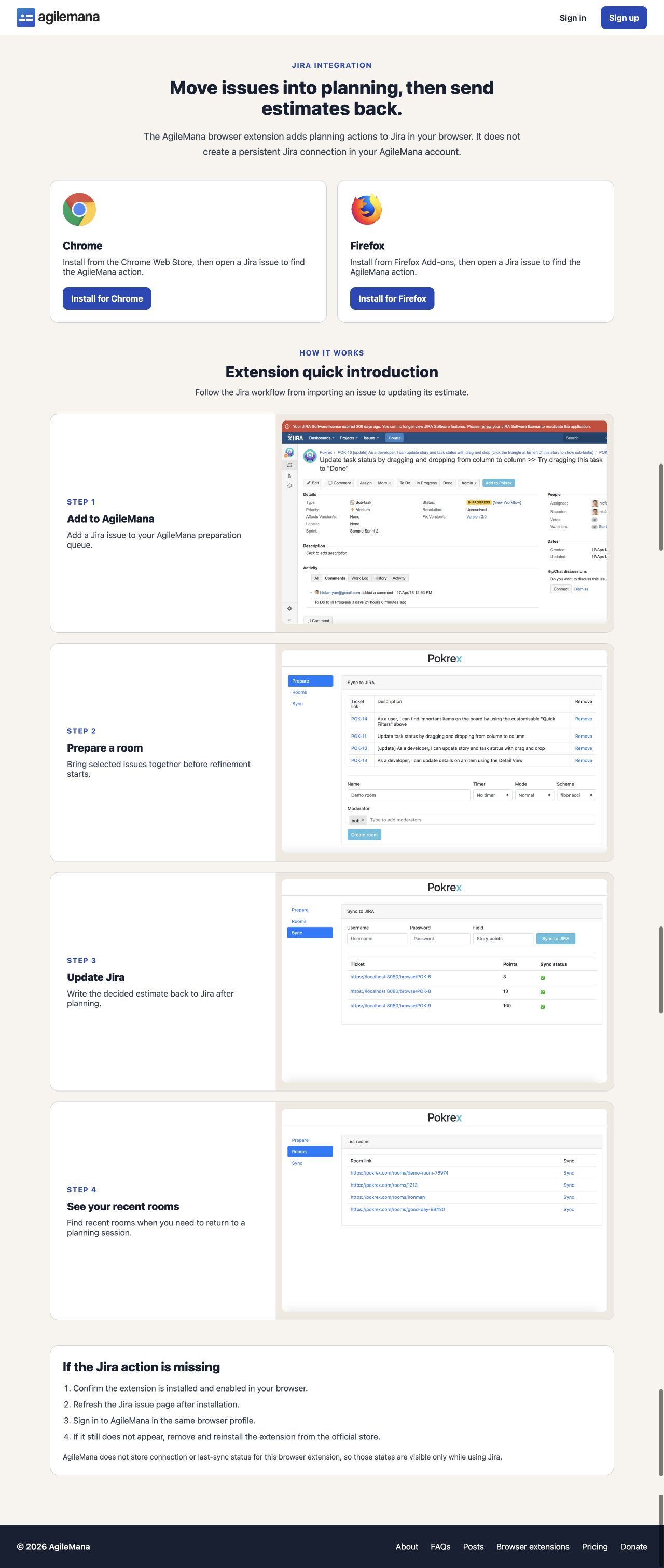
Installation, the Jira workflow, extension capabilities, and troubleshooting are separated into clear steps.
Donate
Dashboard
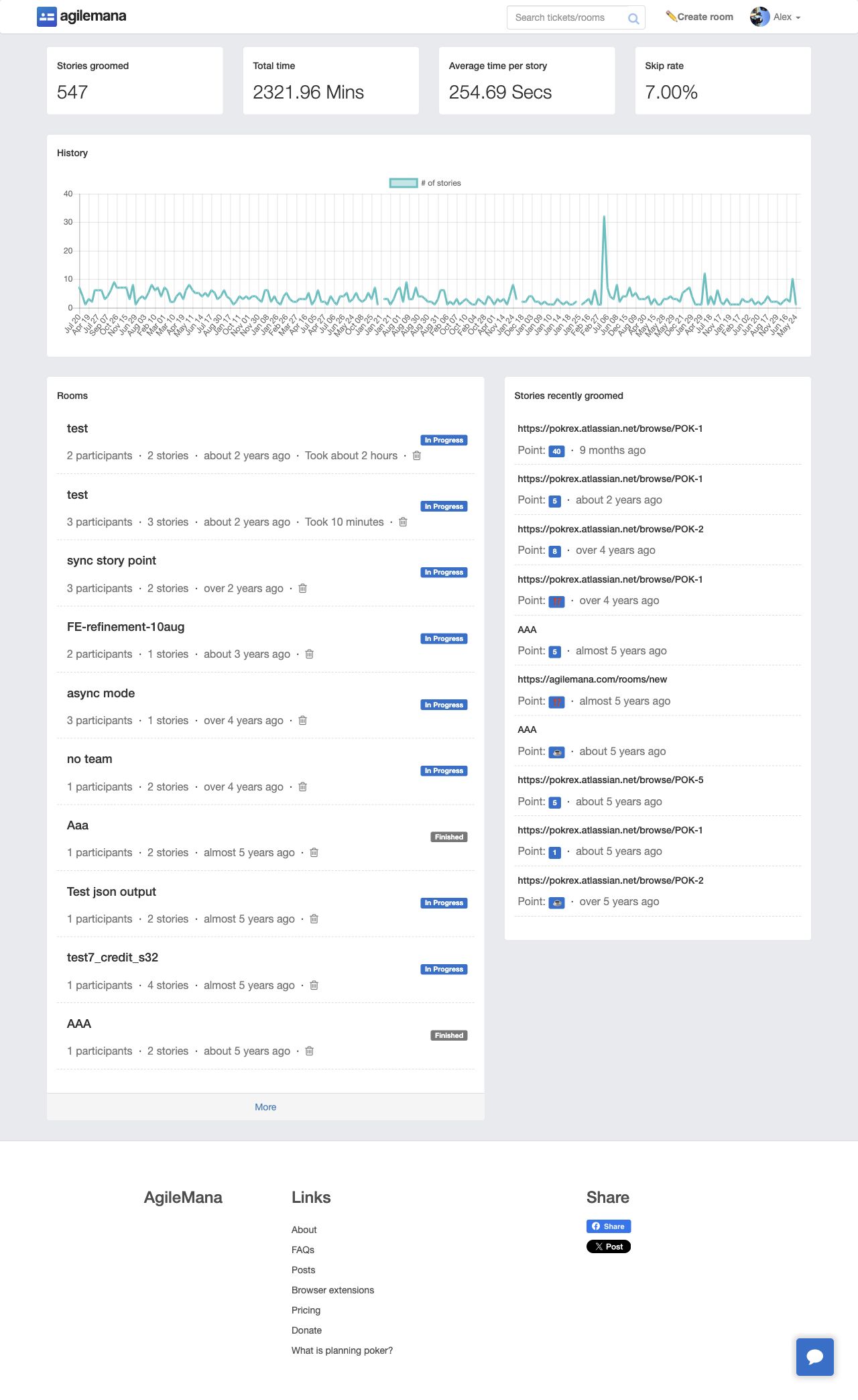
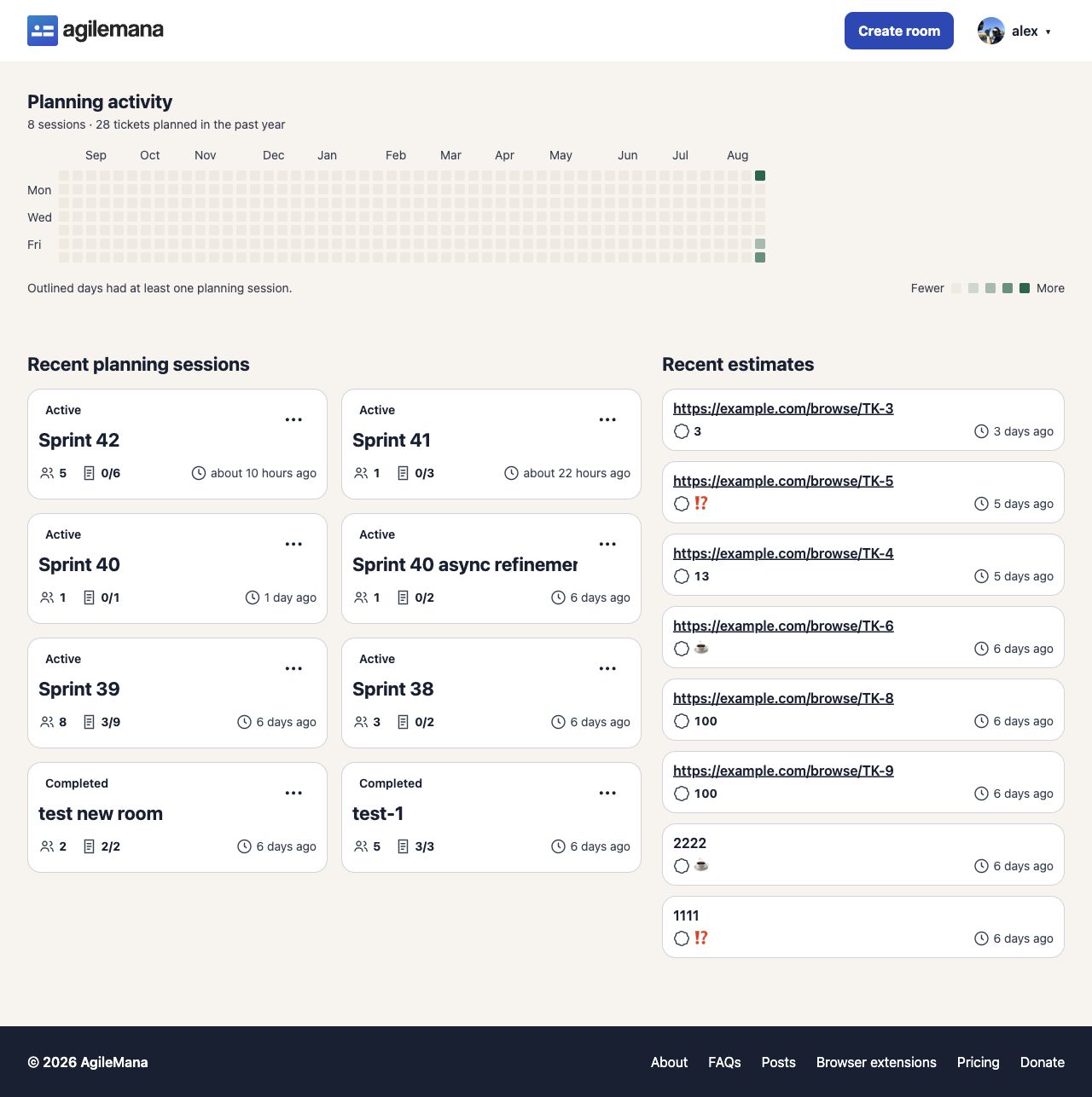
The signed-in home now puts recent sessions and estimates first. Planning activity is easier to scan, while room status and important actions have clearer labels.
Create and edit a room
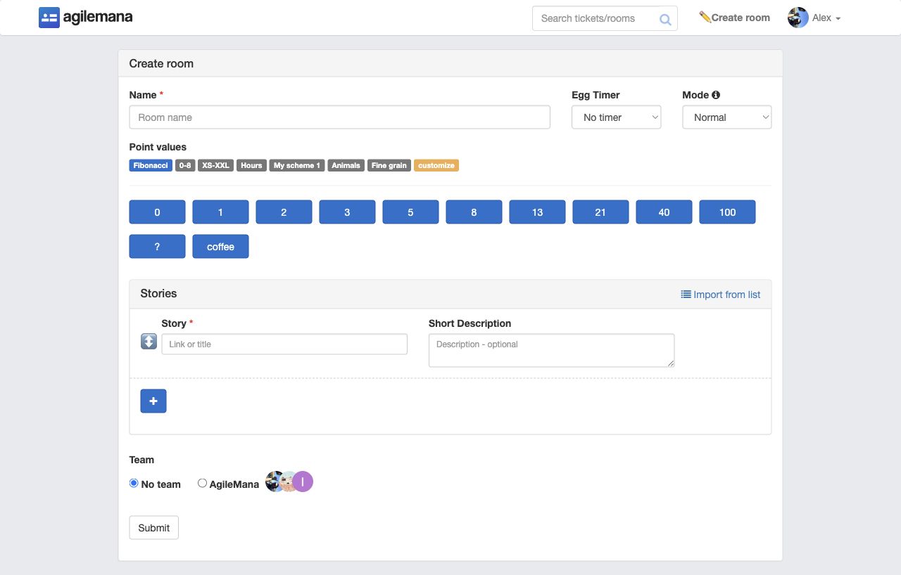
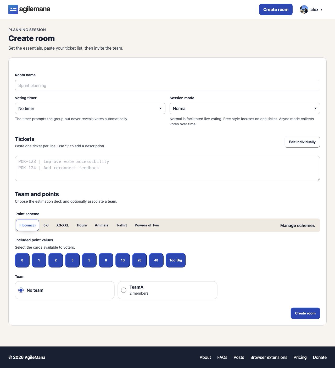
Essential settings come first, with tickets and choices grouped into sections. Helpful descriptions explain timers, room modes, teams, and point schemes. Now it defaults to the textarea for tickets creation.
Point schemes
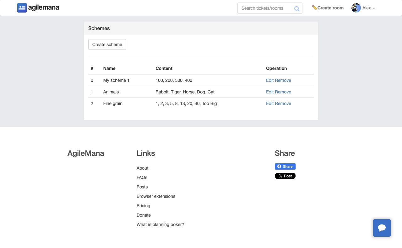
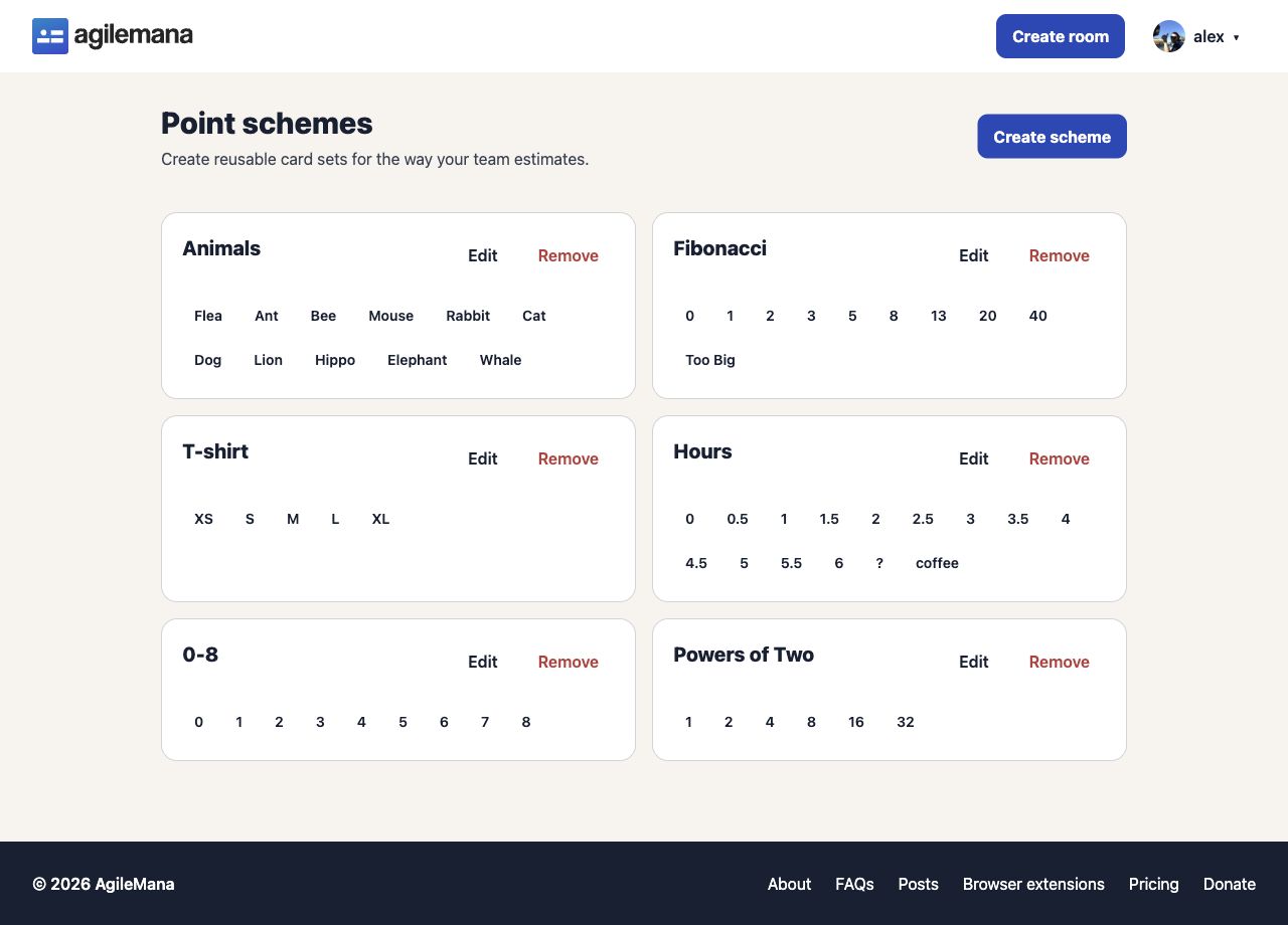
Schemes are now shown as card sets instead of table rows. Creating and editing a scheme also includes clearer limits and guidance for adding values.
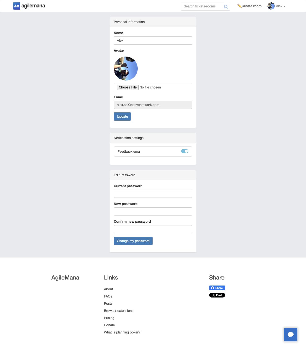
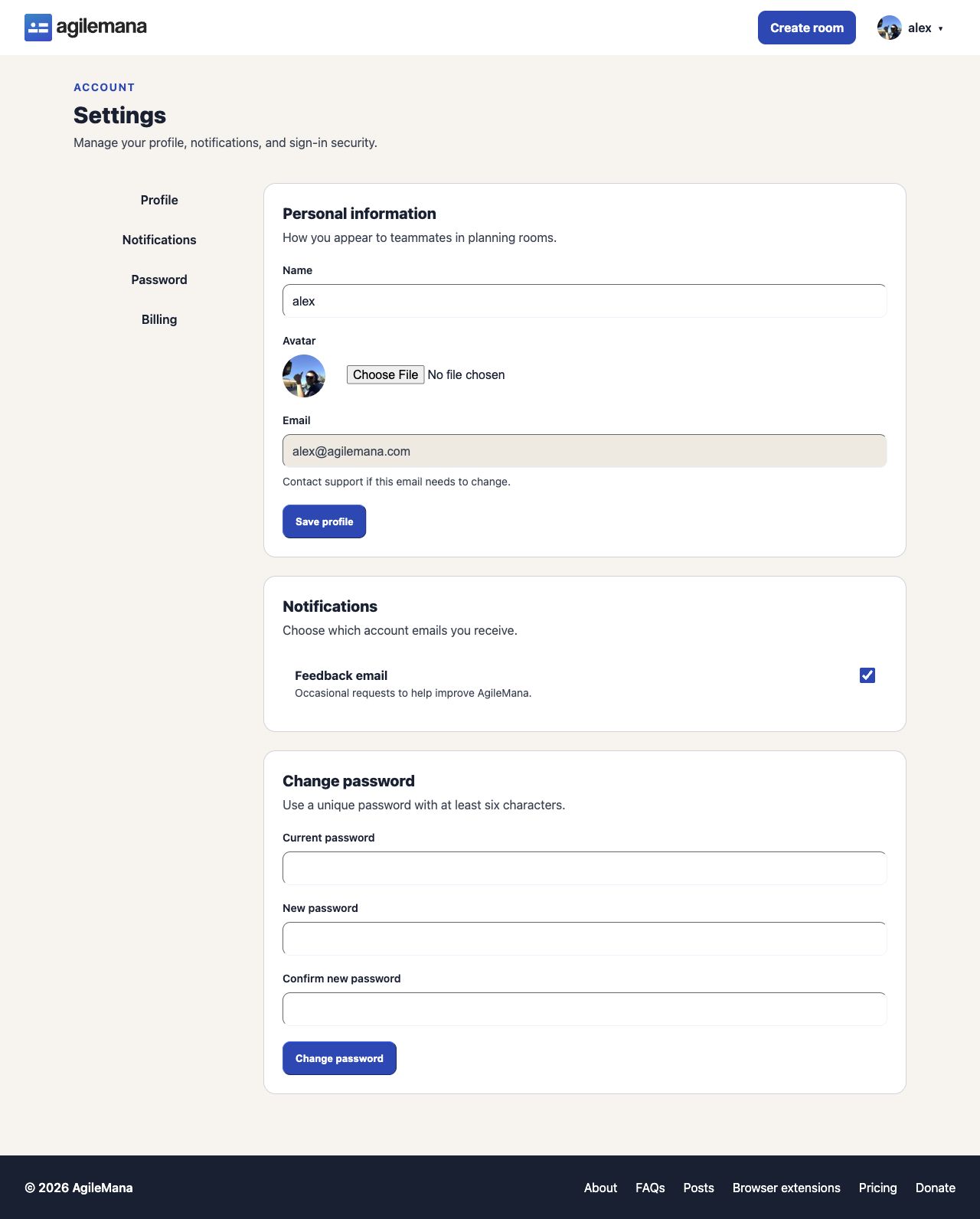
Profile and billing
Teams and referrals
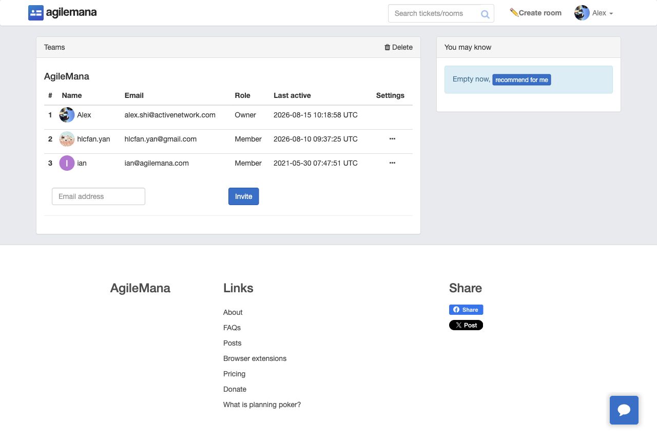
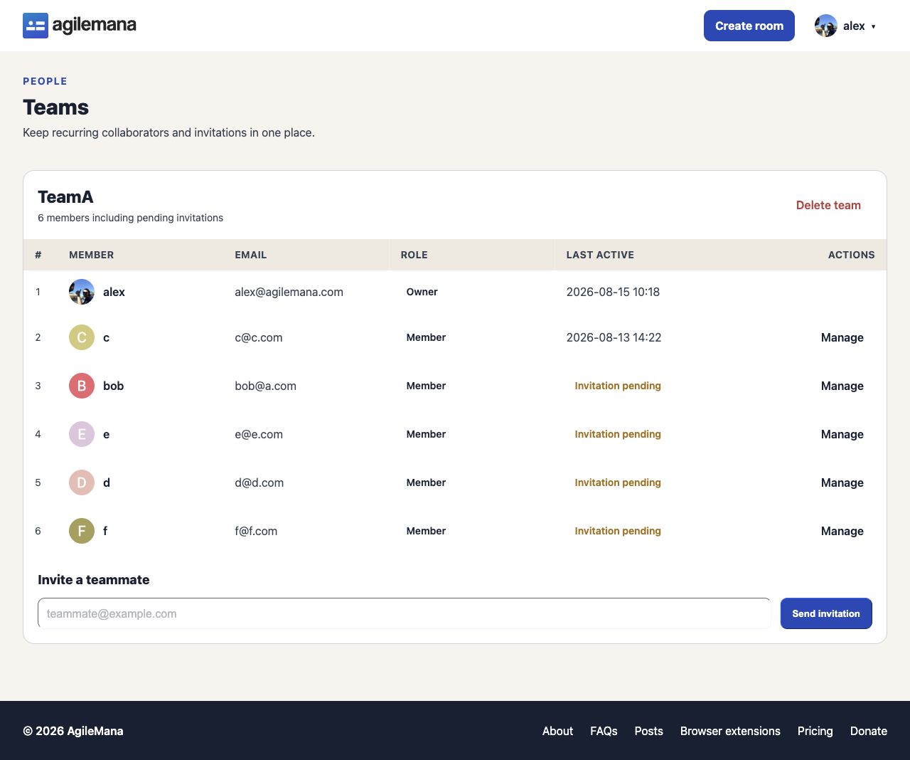
Member roles, pending invitations, and team actions are more explicit. Referrals use the same page hierarchy, with a focused link-sharing area and a clear empty state.
A more consistent experience
The redesign also covers room summaries, empty and error states, invitations, completed estimates, responsive navigation, and supporting account screens. The result is one visual language across guest, participant, moderator, and account journeys.
Publish date: 2026-08-15